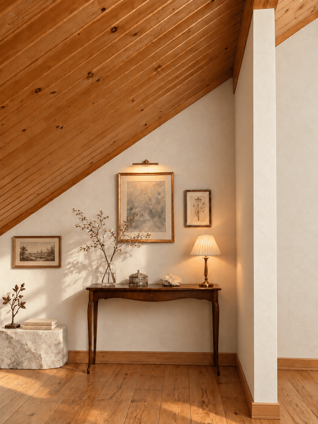
A Small Gallery Beneath the Sloped Ceiling
A fine branch casts its shadow across an ivory wall. Below a softly lit picture, an antique-style console holds glass, metal, and a small piece of stone. This is another way I imagine using a corner of my home: as a small place to display things worth looking at slowly.
This image was created using generative AI based on a photograph of my own home. It shows an interior concept, not a completed renovation. The furnishings, artworks, and decorative objects are illustrative.
Working with the sloping roof
The wooden ceiling gives this corner a strong diagonal line. The partition on the right frames the space, while the wall beneath the roof offers an uneven area for display.
In this concept, the arrangement follows those differences in height. The main framed work sits above the console, with a smaller botanical picture beside it. A third, lower picture extends the display toward the left, where the ceiling comes down closer to the floor.
There is no need to make the wall symmetrical. The room already has its own shape, and the objects can find their places within it.
An ivory wall with a little texture
I imagined replacing the patterned wall finish with an unbleached ivory, diatomaceous-earth plaster finish. Its subtle irregularities give the light something to reveal without making the wall itself a large decorative feature.
The pale surface also separates the darker console from the timber ceiling. Between these two areas of wood, the wall leaves room for the fine outlines of the frames, branches, and lamp.
In the image, the texture is most visible where light passes across the surface at an angle. Elsewhere, it becomes a quieter background.
Rough stone beside fine ornament
The low marble piece on the left changes the balance of the arrangement. Its broken outline and rough surface contrast with the console’s slender legs and the more precise shapes of the framed pictures.
A small metal botanical ornament and two books sit on its upper surface. The idea is to let the stone have a presence of its own, rather than disguise it as a perfectly square piece of furniture.
On the console, the relationships are smaller: transparent glass beside a finely detailed silver-coloured box, a natural stone beside the lamp’s narrow stem. These differences in weight and texture are what make the corner interesting to me.
For an actual room, a stone display base would need a stable footprint and suitable support beneath its weight. Here, it is part of the visual concept.
Light that reveals the details
The picture light draws attention to the larger framed work. The pleated shade of the table lamp makes a softer pool of light at the other end of the console.
Daylight reaches in from the left, revealing the wall texture and the branch’s shadow. The vase stays transparent enough for that shadow to become part of the display.
The lighting is doing more than making the corner brighter. It helps distinguish paper from glass, smooth metal from rough stone, and the pale wall from the darker wood.
Giving the left side a place in the composition
With everything gathered above one console, the arrangement felt isolated in the middle of the wall. The lower picture and marble base give the left side its own point of interest.
They remain below the sloping ceiling and leave open wall space between the two displays. The eye can move across the corner without every surface needing an object.
That is the feeling I wanted to explore: a small gallery within a real home, shaped by the room’s existing structure. Warm timber, pale mineral surfaces, delicate ornament, and a few shadows—enough to make an ordinary corner worth another look.

コメント